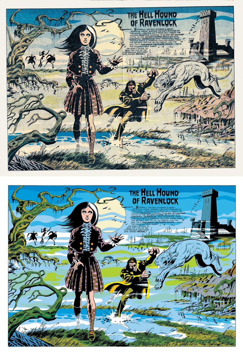
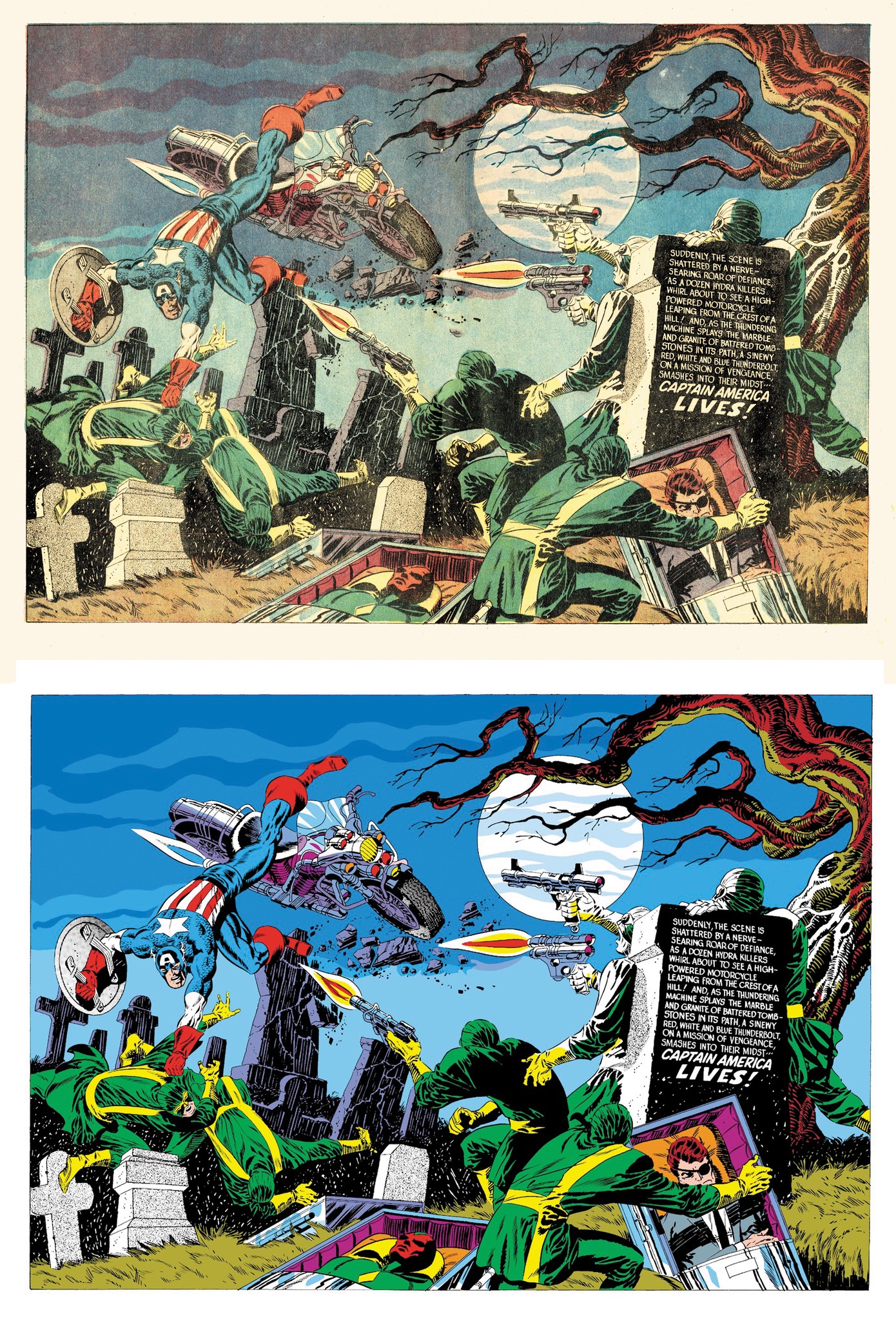
There is a dark side, literally, to digital comic book coloring. Having more colors to work with meant more finely shaded tones. But what looks great on a computer screen can appear muddy on the printed page. This video is about the opposite problem, with colors being too bright.
Chris at Comic Tropes apologizes to José Villarrubia for not crediting him as the source for some of the images he used. Here are a couple of Jim Steranko examples that José posted on Facebook.
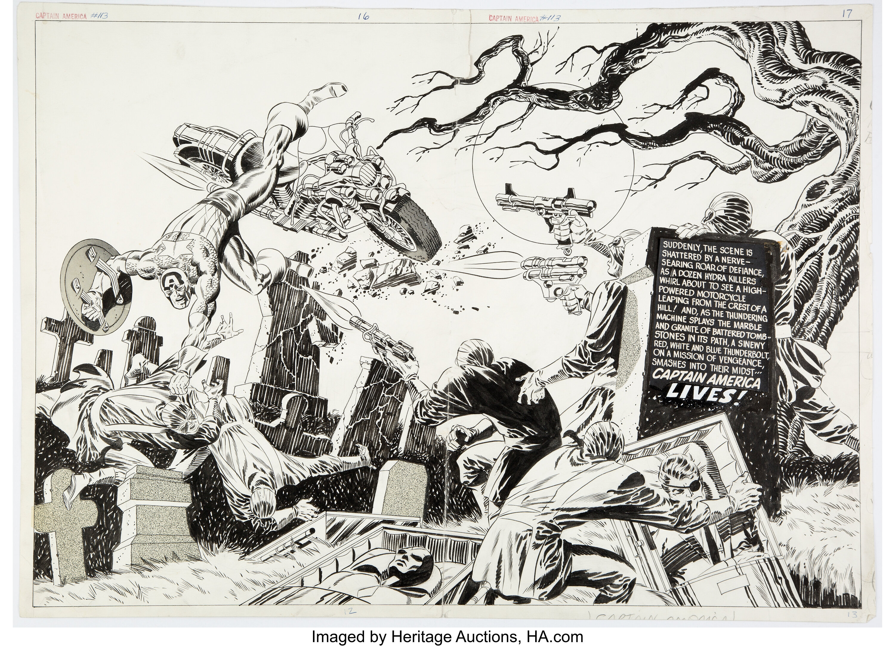
For this next one I’m adding a Heritage Auctions image of the original art. Looking at it full size, you can see that most of the white lettering is a negative image made on a stat camera and pasted onto the art. In a past life I was proficient at stat camera and paste-up work. Never had a chance to try preparing color separations.
I’m not a fan of glossy paper for comic books. The Marvel Omnibus volumes are guilty of both overly bright colors and glossy paper, along with some poor restoration of linework.
Comic book letterer Todd Klein has this view on the subject of coloring. Todd mentions his use of #3 Winsor-Newton Series 7 brushes, which was also Joe Sinnott’s favorite brush.
https://kleinletters.com/Blog/coloring-comics-old-school/
